
In Print
Project: Typography Book
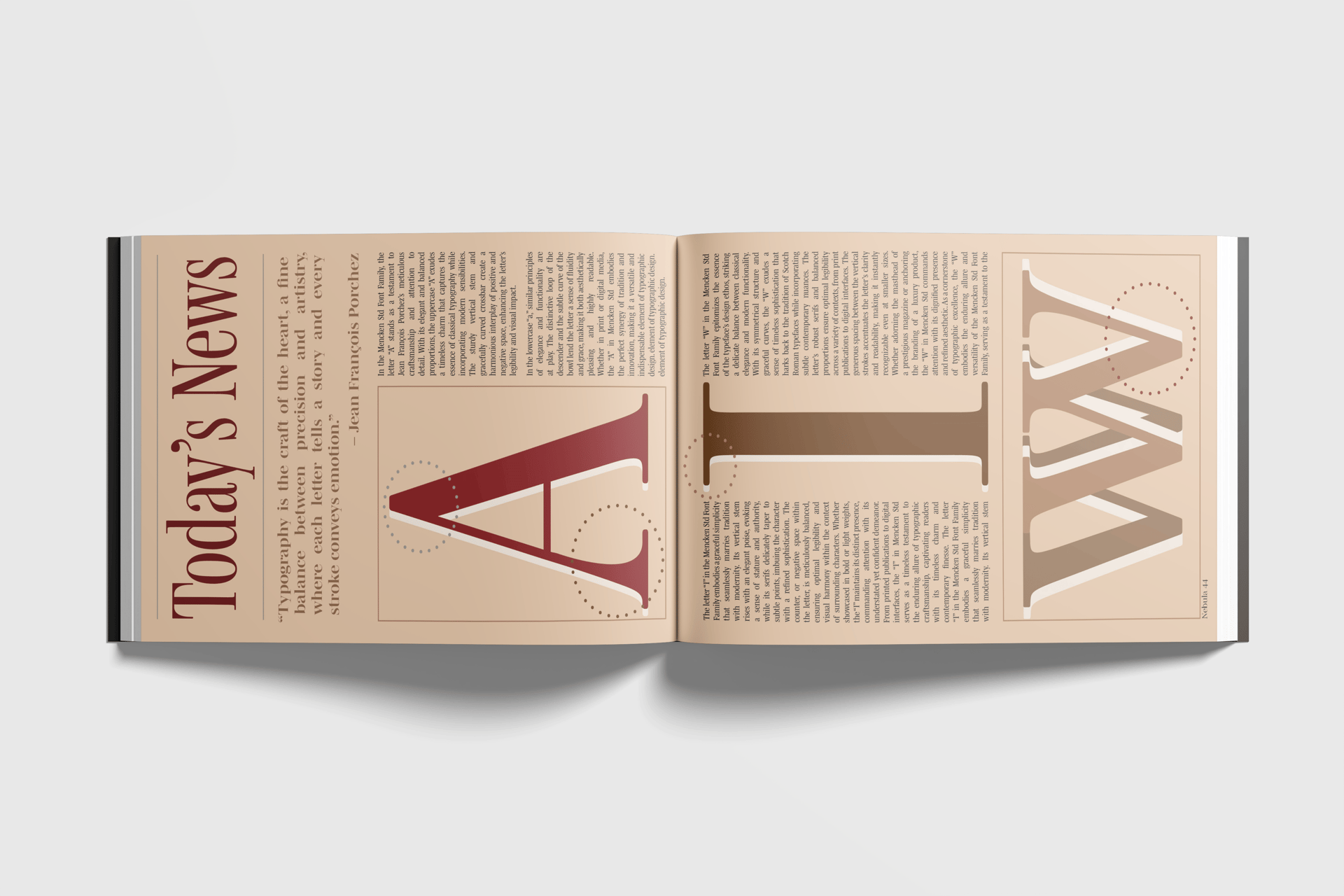
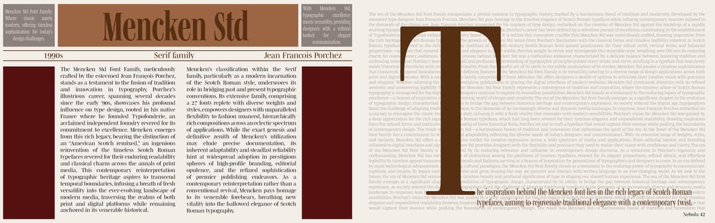
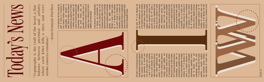
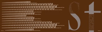
In this collaborative project, each student focused on one typeface to design a section of a collective book. I chose Mencken Std, a font widely used in newspapers and magazines. Inspired by its roots, I built my four-page spread around editorial aesthetics—clean grids, column structures, and typographic rhythm. I leaned into classic print themes to highlight the typeface’s historical context and its continued relevance in modern media. Together with my group, we assembled a cohesive book that showcased the diversity and personality of each font through thoughtful design.


Book pages